Borders
Use border utilities to quickly style the border and border-radius of an element.
Borders
Use border utilities to add or remove an element’s borders. Choose from all borders or one at a time.

<ph outputclass="border">...</ph>
<ph outputclass="border-top">...</ph>
<ph outputclass="border-end">...</ph>
<ph outputclass="border-bottom">...</ph>
<ph outputclass="border-start">...</ph>
Border Specialization
The @border and @rounded attributes provide a semantic way to add borders and rounded corners.
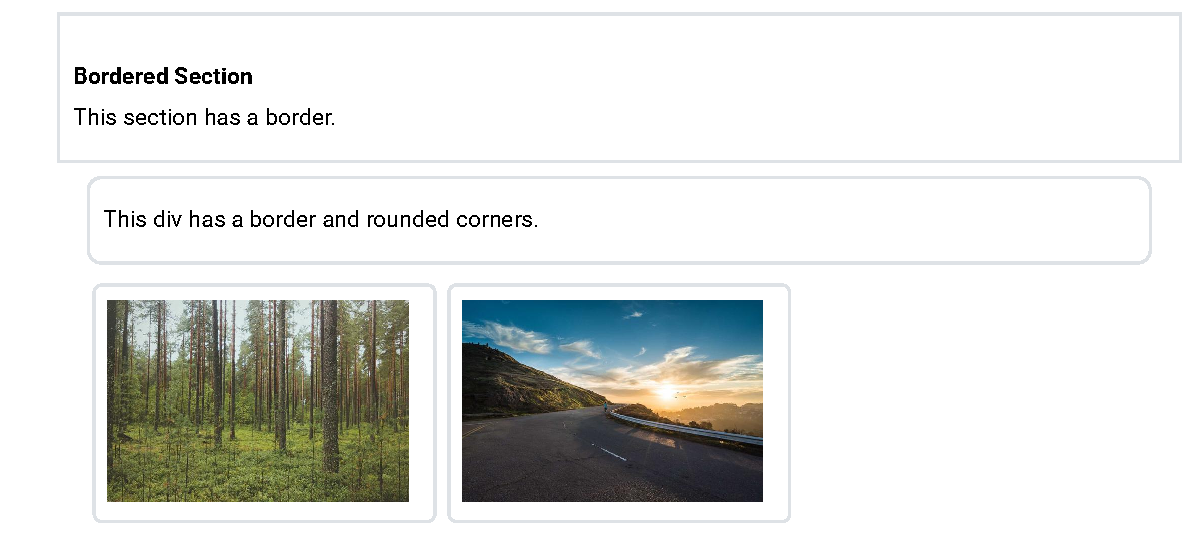
<section border="yes" padding="2">
  ...
</section>

<div border="yes" rounded="yes" padding="2" margin="2">
  ...
</div>

<carousel border="yes" rounded="yes" margin="2" width="50">
  <carousel-item>
    <image href="..."/>
  </carousel-item>
  <carousel-item>
    <image href="..."/>
  </carousel-item>
</carousel><section outputclass="border p-2">
...
</section>
<div outputclass="border rounded p-2 m-2">
...
</div>
<ul outputclass="carousel border rounded m-2 w-50">
...
</ul>Border Styling
The @border attribute also accepts numeric values 1-5 for width. The @rounded attribute
supports values 0-5, circle and pill.
The @bordercolor attribute can be used to set the color of the border.

<ph border="1">Width 1</ph>
<ph border="2">Width 2</ph>
<ph border="3">Width 3</ph>
<ph border="4">Width 4</ph>
<ph border="5">Width 5</ph><ph outputclass="border border-1">Width 1</ph>
<ph outputclass="border border-2">Width 2</ph>
<ph outputclass="border border-3">Width 3</ph>
<ph outputclass="border border-4">Width 4</ph>
<ph outputclass="border border-5">Width 5</ph>
<ph bordercolor="primary">Primary</ph>
<ph bordercolor="primary-subtle">Primary subtle</ph>
<ph bordercolor="success">Success</ph>
<ph bordercolor="danger">Danger</ph><ph outputclass="border border-primary">Primary</ph>
<ph outputclass="border border-primary-subtle">Primary subtle</ph>
<ph outputclass="border border-success">Success</ph>
<ph outputclass="border border-danger">Danger</ph>
<ph border="yes" rounded="0">Rounded 0</ph>
<ph border="yes" rounded="1">Rounded 1</ph>
<ph border="yes" rounded="2">Rounded 2</ph>
<ph border="yes" rounded="3">Rounded 3</ph>
<ph border="yes" rounded="4">Rounded 4</ph>
<ph border="yes" rounded="5">Rounded 5</ph><ph outputclass="border rounded-0">Rounded 0</ph>
<ph outputclass="border rounded-1">Rounded 1</ph>
<ph outputclass="border rounded-2">Rounded 2</ph>
<ph outputclass="border rounded-3">Rounded 3</ph>
<ph outputclass="border rounded-4">Rounded 4</ph>
<ph outputclass="border rounded-5">Rounded 5</ph>
<ph border="yes" rounded="circle" bordercolor="info">Circle</ph>
<ph border="yes" rounded="pill" bordercolor="dark">Pill</ph><ph outputclass="border rounded-circle border-info">Circle</ph>
<ph outputclass="border rounded-pill border-dark">Pill</ph>Frame attribute support
For DITA elements which support the @frame attribute, such as <lines>
and <codeblock>, additional frame borders are automatically added as shown:
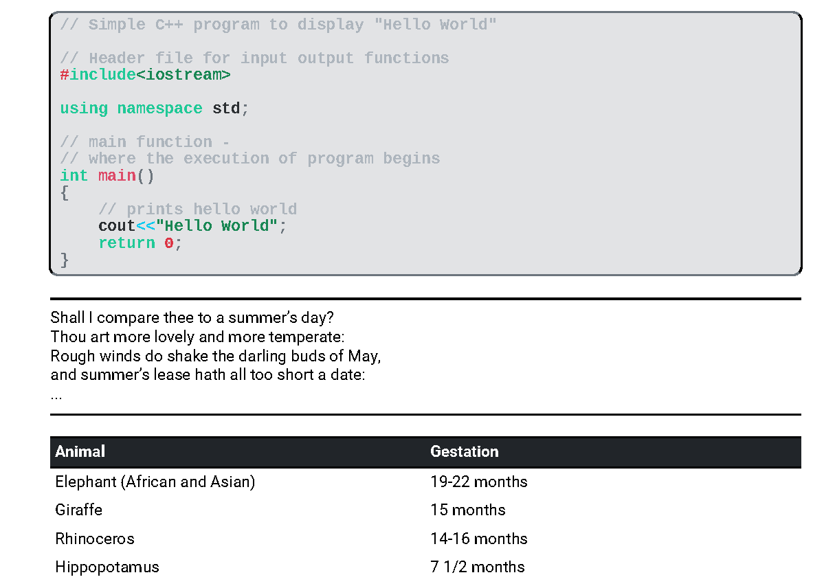
<codeblock frame="sides">...</codeblock>
<lines frame="topbot"
  outputclass="bg-secondary-subtle p-3 border rounded">
  ...
</lines>
<table frame="all">...</table>