Color
Convey meaning through color with a handful of color utility classes. Includes support for
styling text and background colors via the semantic @color attribute.
Colors
Colorize text and backgrounds with color utilities. The @color attribute provides a semantic way to apply standard Bootstrap color themes.
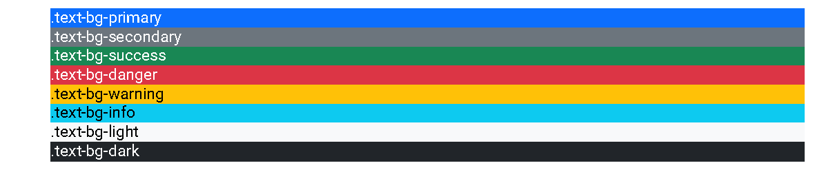
<div color="primary">.text-bg-primary</div>
<div color="secondary">.text-bg-secondary</div>
<div color="success">.text-bg-success</div>
<div color="danger">.text-bg-danger</div>
<div color="warning">.text-bg-warning</div>
<div color="info">.text-bg-info</div>
<div color="light">.text-bg-light</div>
<div color="dark">.text-bg-dark</div><div outputclass="text-bg-primary">.text-bg-primary</div>
<div outputclass="text-bg-secondary">.text-bg-secondary</div>
<div outputclass="text-bg-success">.text-bg-success</div>
<div outputclass="text-bg-danger">.text-bg-danger</div>
<div outputclass="text-bg-warning">.text-bg-warning</div>
<div outputclass="text-bg-info">.text-bg-info</div>
<div outputclass="text-bg-light">.text-bg-light</div>
<div outputclass="text-bg-dark">.text-bg-dark</div>Base DITA Elements
Decoration attributes can be applied to many base DITA elements to add background color and contrasting text.
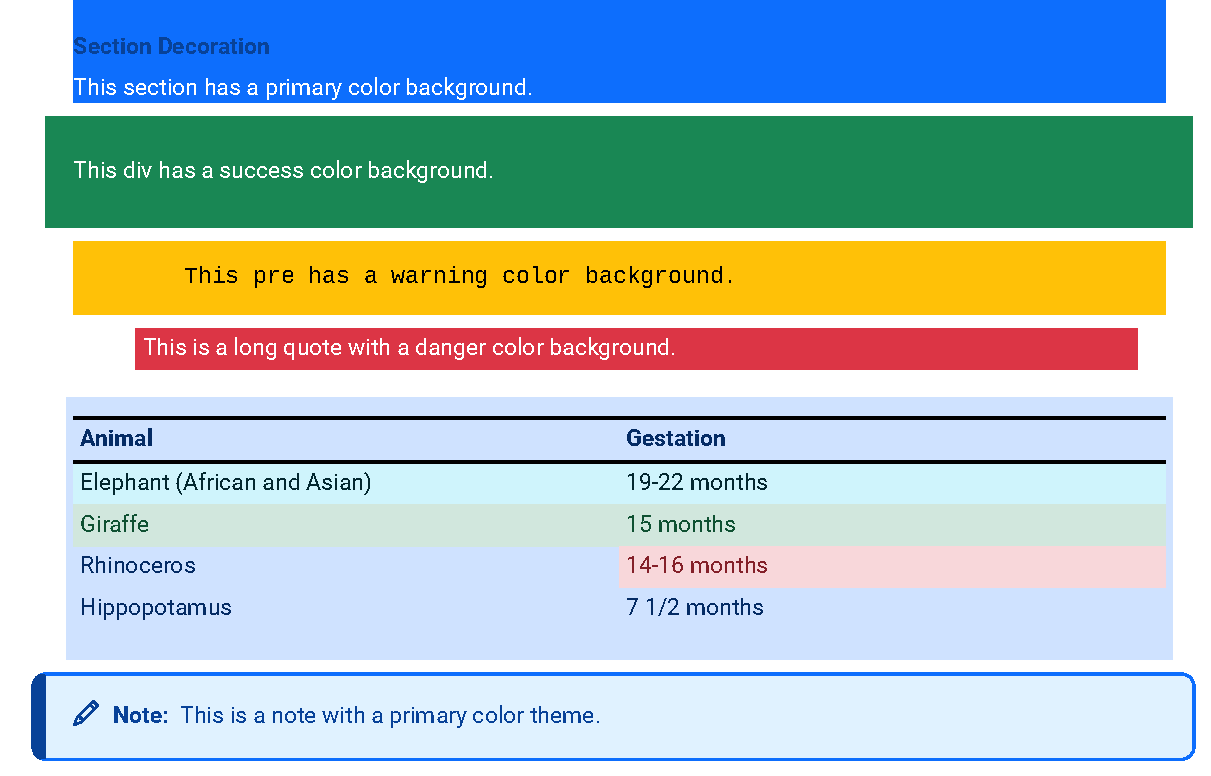
<section color="primary">
  <title>Section Decoration</title>
  <p>This section has a primary color background.</p>
</section>

<div color="success" padding="3">
  <p>This div has a success color background.</p>
</div>

<pre color="warning">
  This pre has a warning color background.
</pre>

<lq color="danger" padding="1">
  This is a long quote with a danger color background.
</lq>

<table color="primary" padding="1" width="100">
  <tgroup cols="2">
    <thead>
      <row>
        <entry>Animal</entry>
        <entry>Gestation</entry>
      </row>
    </thead>
    <tbody>
      <row color="info">
        ...
      </row>
      <row color="success">
        ...
      </row>
      <row>
        <entry>...</entry>
        <entry color="danger">...</entry>
      </row>
      <row>
        ...
      </row>
    </tbody>
  </tgroup>
</table>

<note color="primary">
  This is a note with a primary color theme.
</note><section outputclass="text-bg-primary">
<title>Section Decoration</title>
<p>This section has a primary color background.</p>
</section>
<div outputclass="text-bg-success p-3">
<p>This div has a success color background.</p>
</div>
<pre outputclass="text-bg-warning">
This pre has a warning color background.
</pre>
<lq outputclass="text-bg-danger p-1">
...
</lq>
<table outputclass="table-primary p-1 w-100">
<tgroup cols="2">
<thead>
<row>
<entry>Animal</entry>
<entry>Gestation</entry>
</row>
</thead>
<tbody>
<row outputclass="table-info">
...
</row>
<row outputclass="table-success">
...
</row>
<row>
<entry>...</entry>
<entry outputclass="table-danger">...</entry>
</row>
<row>
<entry>...</entry>
<entry>...</entry>
</row>
</tbody>
</tgroup>
</table>
<note color="primary">
...
</note>Bootstrap Components
Many specialized components also support the @color attribute for consistent theming.
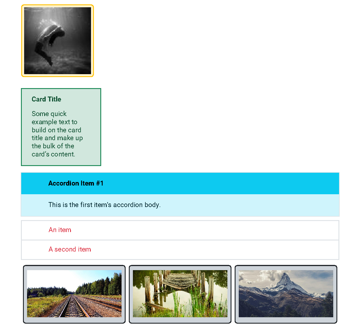
<thumbnail href="..." color="warning"/>

<card color="success" width="50">
  <title>Card Title</title>
  <p>Some quick example text to build on the card title and make up the bulk of the card’s content.</p>
</card>

<accordion color="info">
  <accordion-item open="yes">
    <title>Accordion Item #1</title>
    <p>This is the first item's accordion body.</p>
  </accordion-item>
</accordion>

<list-group width="50" color="danger">
  <li>An item</li>
  <li>A second item</li>
</list-group>

<carousel color="dark" width="50" indicators="yes">
  <carousel-item>
    <image href="..."/>
  </carousel-item>
  <carousel-item>
    <image href="..."/>
  </carousel-item>
  <carousel-item>
    <image href="..."/>
  </carousel-item>
</carousel><img src="..." class="img-thumbnail bg-warning"/>
<section outputclass="card text-bg-success w-50">
...
</section>
<bodydiv outputclass="accordion accordion-info">
...
</bodydiv>
<ul outputclass="list-group list-group-item-danger w-50">
...
</ul>
<ul outputclass="carousel carousel-dark w-50">
...
</ul>Text Color
For text-only colorization, the @outputclass attribute remains the primary method.
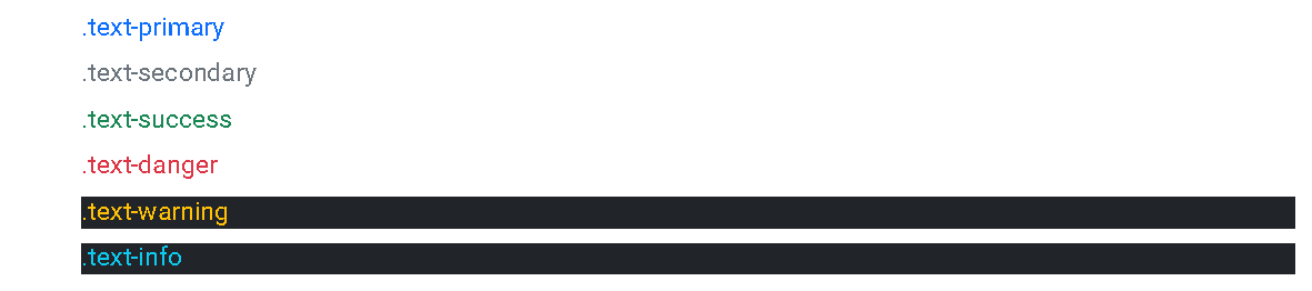
<p outputclass="text-primary">.text-primary</p>
<p outputclass="text-secondary">.text-secondary</p>
<p outputclass="text-success">.text-success</p>
<p outputclass="text-danger">.text-danger</p>
<p outputclass="text-warning bg-dark">.text-warning</p>
<p outputclass="text-info bg-dark">.text-info</p>