Typography
Documentation and examples for Bootstrap typography, including global settings, headings, body text, lists, and more.
Headings
All HTML headings, <h1> through <h6>, are available.
@outputclass="h1" through @outputclass="h6" are also available, for when you
want to match the font styling of a heading but cannot use the associated HTML element.
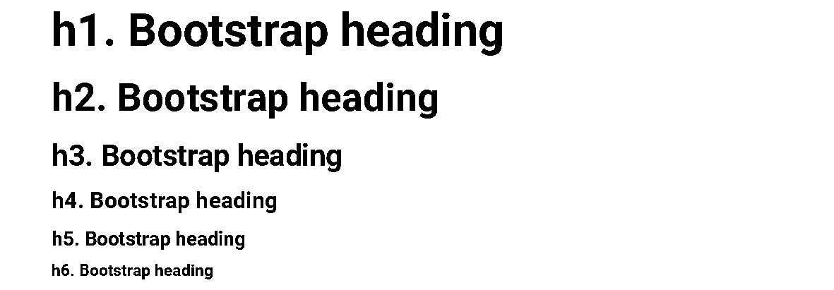
<title outputclass="h1">h1. Bootstrap heading</title>
<title outputclass="h2">h2. Bootstrap heading</title>
<title outputclass="h3">h3. Bootstrap heading</title>
<title outputclass="h4">h4. Bootstrap heading</title>
<title outputclass="h5">h5. Bootstrap heading</title>
<title outputclass="h6">h6. Bootstrap heading</title>
Display headings
Traditional heading elements are designed to work best in the meat of your page content. When you need a heading to stand out, consider using a display heading — a larger, slightly more opinionated heading style.
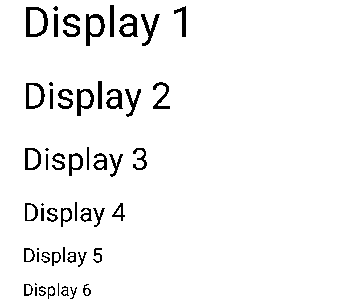
<title outputclass="display-1">Display 1</title>
<title outputclass="display-2">Display 2</title>
<title outputclass="display-3">Display 3</title>
<title outputclass="display-4">Display 4</title>
<title outputclass="display-5">Display 5</title>
<title outputclass="display-6">Display 6</title>
Lead
Make a paragraph stand out by adding @outputclass="lead" — this is automatically added to
<shortdesc> elements.

<p outputclass="lead">
  This is a lead paragraph. It stands out from regular paragraphs.
</p>
Text utilities
Change text alignment, transform, style, weight, line-height, decoration and color with Bootstrap’s text and color utilities.
Blockquotes
For quoting blocks of content from another source within your document, use the DITA
<lq> element, it is styled automatically.

<lq>
  <p>A well-known quote, contained in a blockquote element.</p>
</lq>
Naming a source
The HTML spec requires that blockquote attribution be placed outside the rendered HTML
<blockquote> element. When providing attribution, wrap your the DITA
<lq> in a <fig> and add a <title> to the
<fig>. Be sure to wrap the name of the source work in the <cite>
as well.

<fig>
  <title>Someone famous in <cite>Source Title</cite></title>
  <lq >
    <p>A well-known quote, contained in a blockquote element.</p>
  </lq>
</fig>
Lists
Unstyled
Remove the default list-style and left margin on list items (immediate children only). This only applies to
immediate children list items, meaning you will need to add the @outputclass="list-unstyled" for
any nested lists as well.

<ul outputclass="list-unstyled">
  <li>This is a list.</li>
  <li>It appears completely unstyled.</li>
  <li>Structurally, it’s still a list.</li>
  <li>However, this style <b>only applies to immediate child elements</b>.</li>
  <li>Nested lists:
    <ul>
      <li>are unaffected by this style</li>
      <li>will still show a bullet</li>
      <li>and have appropriate left margin</li>
    </ul>
  </li>
  <li>This may still come in handy in some situations.</li>
</ul>
Inline
Remove a list’s bullets and apply some light margin using the
@outputclass="list-inline" attribute.

<ul outputclass="list-inline">
  <li>This is a list item.</li>
  <li>And another one.</li>
  <li>But they're displayed inline.</li>
</ul>
Description list alignment
Terms and descriptions align horizontally using Bootstrap’s grid system of predefined classes. For longer terms, text is truncated with an ellipsis.
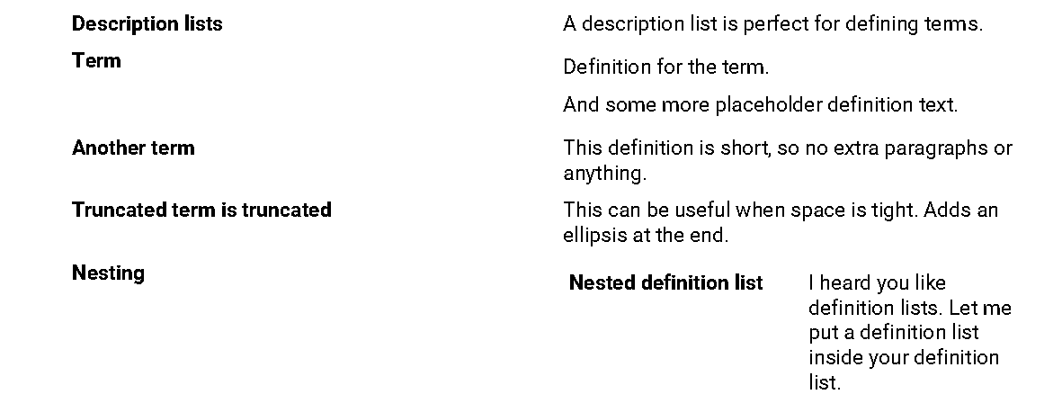
<dl>
  <dlentry>
    <dt>Description lists</dt>
    <dd>A description list is perfect for defining terms.</dd>
  </dlentry>
  <dlentry>
    <dt>Term</dt>
    <dd>
      <p>Definition for the term.</p>
      <p>And some more placeholder definition text.</p>
    </dd>
  </dlentry>
  <dlentry>
    <dt>Another term</dt>
    <dd>This definition is short, so no extra paragraphs or anything.</dd>
  </dlentry>
  <dlentry>
    <dt>Truncated term is truncated</dt>
    <dd>This can be useful when space is tight. Adds an ellipsis at the end.</dd>
  </dlentry>
  <dlentry>
    <dt>Nesting</dt>
    <dd>
      <dl>
        <dlentry>
          <dt>Nested definition list</dt>
          <dd>I heard you like definition lists. Let me put a definition list
            inside your definition list.</dd>
        </dlentry>
      </dl>
    </dd>
  </dlentry>
</dl>
Description list column width
Definitions lists use the twelve column system defined by the Bootstrap grid. By default each <dt> spreads over 3 column widths and each <dd> spreads over 9 column widths. Alter default width of terms by adding @colspan

<dl colspan="2">
  <dlentry>
    <dt>Description lists</dt>
    <dd>A description list is perfect for defining terms.</dd>
  </dlentry>
  <dlentry>
    <dt>Term</dt>
    <dd>
      <p>Definition for the term.</p>
      <p>And some more placeholder definition text.</p>
    </dd>
  </dlentry>
</dl><dl otherprops="cols(2)">
<dlentry>
<dt>Description lists</dt>
<dd>A description list is perfect for defining terms.</dd>
</dlentry>
<dlentry>
<dt>Term</dt>
<dd>
<p>Definition for the term.</p>
<p>And some more placeholder definition text.</p>
</dd>
</dlentry>
</dl>